A measurement strategy to address disparities across household energy burdens – Nature.com
Energy Disrupter
Applying net energy return to energy equity
The main contribution of the study is the application of NER as an indicator of household energy poverty by utilizing a set of energy burden metrics based on NER to represent the disparity across those who face significant energy burdens in the US with those who do not. NER displays critical thresholds where more households face energy and income challenges.
The NER of a process is a relationship between the gross amount of energy extracted and the amount of embodied energy directed toward extraction27. For households extracting income from the economy, these ratios can be composed of gross income (G) and spending on energy (S).
Household NER (Nh) represents the net earnings a household receives for every expenditure on secondary energy, defined according to Eq. (2):
$${{{{{\rm{Household}}}}}}\,{{{{{\rm{Net}}}}}}\,{{{{{\rm{Energy}}}}}}\,{{{{{\rm{Return}}}}}}\,({N}_{h})=\frac{G-S}{S}$$
(2)
The NER is the standard metric of NEA because it reflects the role of energy as an input to a value-generating process in ecosystems28. Eb is the metric of choice in the energy insecurity literature due to its presumed interpretability as a percentage14,16,19,21
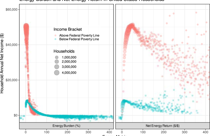
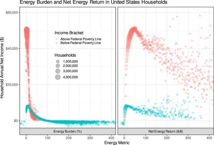
While most ERRs, including NER, are hyperbolic paraboloids, NER has several useful mathematical properties: it can smoothly handle systems with negative incomes and energy costs, accept households with zero income, and emphasize extreme incomes and energy costs in an interpretable fashion, as shown in Fig. 1. While Eb appears inversely correlated to income, this is primarily driven by a long tail of households with zero or very low incomes, often with energy expenditures exceeding their incomes (approximately n = 118,000 households in the dataset have Eb > 100% or Eb < 0%). Due to the structure of the Eb equation (Eq. 1), the Eb of these households approaches infinity and cannot be captured on the standard 0-100% scale the metric is intended to be interpreted within: around 37,000 homes have an infinite energy burden. Since LEAD is estimated and provided for the express purpose of exploring low-income communities, we are hesitant to discard these households as outliers. Nh provides a framing of the same dataset that allows for exploration of most households on a similar scale without the long tail. Nh appears positively related to income, and most communities appear within a few orders of magnitude. Utilizing Nh avoids discarding low-income communities as outliers in energy poverty analysis. Furthermore, Nh offers a way to view the relationship between energy expenditures and income such that the wide disparity between those in broader poverty is immediately apparent. Many households with moderate-to-high Ebs are actually higher-income households with high energy expenditures, making their Nhs quite high (e.g., >$100 of income per $1 of energy spending). Almost 100% of the households in the dataset have net incomes between −$1000 and $60,000, with Nhs (or Ebs) of between −10 (−10%) and 400 (400%). Only households with no energy costs are excluded from the analysis, whereas households with no energy costs or incomes must be excluded from an analysis utilizing Eb.
While Eb appears inversely correlated to net income, this is primarily driven by a long tail of households with zero or very low incomes, often with energy expenditures exceeding their incomes. Due to the structure of the Eb equation (Eq. 1), the Eb of these households approaches infinity and cannot be captured on the standard 0–100% scale the metric is intended to be interpreted within. Since LEAD is estimated and provided for the express purpose of exploring low-income communities, we are hesitant to discard these households as outliers. Nh frames the same dataset on a scale without the long tail. Nh appears positively related to income, and most communities appear within a few orders of magnitude. Utilizing Nh avoids discarding low-income communities as outliers in energy poverty analysis. Furthermore, Nh offers a way to view the relationship between energy expenditures and income such that the wide disparity between those in broader poverty is immediately apparent: many households with moderate-to-high Ebs are actually higher-income households with high energy expenditures, making their Nhs quite high (e.g., >$100 of income per $1 of energy spending), which is only visible on an Nh scale.
For the discussion of household energy poverty, we are primarily interested in how households of different characteristics are distributed according to their Nhs, representing how many net dollars are earned by a household for every dollar it spends on energy. Since the Nh is unitless but is a ratio of return on investment, we present it below interchangeably with no units or in units of $/$ depending on context. Other proposed indicators of energy poverty may be similarly examined in this manner.
Application to energy poverty
While a variety of thresholds have been developed and explored, energy-poor households in the US are commonly defined in terms of Eb as those with an expenditure of greater than 6% of household income on energy based on the logic that energy expenditures should not be greater than 20% of housing expenses, which themselves should not exceed 30% of household income8. Calibrating our Nh analysis to this level will help gauge different thresholds of energy poverty and benchmark the results of this paper to the energy poverty literature while acknowledging the continuum of experiences across household energy consumption. Translated into its relative level for Nh, the energy poverty line Nh is defined according to Eq. (3) as approximately 16.
$$\begin{array}{c}{E}_{B}^{* }=\frac{S}{G}=6 \% \\ {N}_{h}^{* }=\frac{G-S}{S}\,{{{{{\rm{such}}}}}}\,{{{{{\rm{that}}}}}}\,\frac{S}{G}=6 \% \\ {N}_{h}^{* }\approx 16\Rightarrow {{{{{\rm{Household}}}}}}\,{{{{{\rm{at}}}}}}\,{{{{{\rm{Energy}}}}}}\,{{{{{\rm{Poverty}}}}}}\,{{{{{\rm{Line}}}}}}\end{array}$$
(3)
This means that a household that earns less than approximately $16 of income for every dollar it spends on secondary energy will be considered to be in energy poverty by the traditional Eb accounting method. An Nh of approximately 16 or lower is equivalent to an Eb of 6% or higher. This threshold is arbitrary and may not be suitable in situations where households fall very close to this line or where the numbers of family members or measures of certain building characteristics vary widely. Simply, it is presented as a benchmark. We examine the Nh at a community scale across the US in Table 1.
The US household net energy landscape
We use LEAD23 (n = 113.2 million households) to evaluate the Nh dynamics across the US. The average US home in the dataset has an income of $41,922 and an annual energy expenditure of $1219 ($102/month), which equates to an average Eb of 3% or an average Nh of 33.4. While the dataset slightly overrepresents households below the median income due to the limitations of the statistical methods used to compile them, it represents estimates for approximately 94–95% of the 119.5–120.0 million family-occupied households evaluated by the American Community Survey. Table 1 shows a summary of these data for households and their average statistics delineated by their incomes relative to the median income of similar size families in the same metropolitan area or non-metropolitan county, known as Area Median Income (AMI). We can see that high burdens are found mostly in the very-low-income group, with an average Eb of 14% or Nh of 6.2. Income drives the escape from energy poverty: middle and high-income groups do not spend drastically different amounts on energy (21% and 63% more, respectively) but earn 3 and 10 times that of the very low-income group, respectively. An Eb of 14% means that $71 per month is spent on energy, which is quite high on a monthly income of $510. The additional $15 per month that the next rung of moderate-income groups spends on energy represents a minuscule proportion of their income (1%).
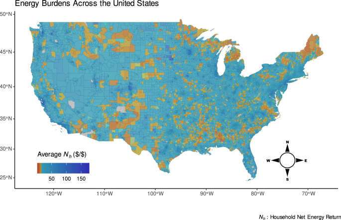
Another contribution of this work is that by using Nh, we can display these data spatially across the US to explore how different communities are experiencing energy outcomes as in Fig. 2 and investigate specific communities at multiple scales such as census tract, county, state, and regional as in Fig. 3. Furthermore, we can break down the data among meaningful subsets as in Fig. 4 and examine state-by-state trends as in Fig. 5. This is useful because the presence of energy inequity is harder to see in urban areas compared to rural areas for which census tracts are a larger physical area or when certain household characteristics such as primary heating fuel are related to widely differing energy outcomes in the same area. Additionally, it shows a spatial variation of energy poverty that includes 5.3 million more households that would not be captured by traditional poverty metrics because their incomes are too low (Eb > 100%) or too high (above the FPL). By processing disparate data sources into a coherent structure and providing a convenient open-source tool for others to do the same, these data can be used in urban planning, public policy, and other relevant contexts.
Shades of yellow and red, respectively, indicate communities at or below the energy poverty line as defined by earning approximately 16 dollars or less in income per dollar of energy expenditures. This corresponds to the traditional definition of energy poverty as spending 6% or more of income on energy. Low Nhs can be starkly observed in the Black Belt across the Southeastern US, Hispanic communities near the US-Mexico border, Native American lands, and rural New England.
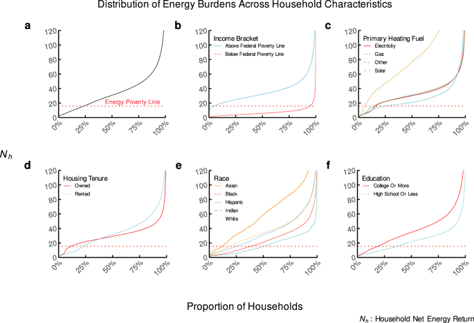
Subfigure (a) shows the overall distribution. Subfigure (b) shows the difference among those groups of households above and below the Federal Poverty Line. Subfigure (c) shows the difference among groups of households identified by their primary heating fuel. Subfigure (d) shows the difference based on whether they are renters or owners. Subfigure (e) shows the difference based on the most prominent race in the census tract of each cohort. Subfigure (f) shows the difference based on the most prominent education history in the census tract of each cohort.
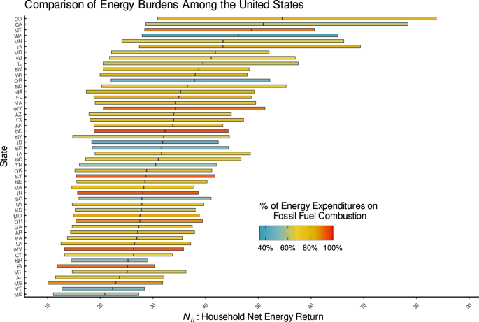
The bars are sorted by median household Nh and represent the interquartile range (25%-75% percentiles) of household Nhs colored by the percent of household energy expenditures in each state that goes to support fossil-fuel combustion, whether directly through natural gas purchases or indirectly through the electricity grid in each state. Natural gas purchases are assumed to be entirely combusted by the end-user, and electricity purchases are divided into their respective sources according to the US Environmental Protection Agency’s (EPA) Emissions and Generation Resource Integrated Database (eGRID) for each state. Other expenditures are divided according to the primary heating fuels other than electricity or natural gas used by American households according to the Census, which are approximately 75% fossil-fuel combustion. The figure suggests that a reliance on fossil-fuel combustion does not lead to a more affordable energy system for end-users.
Displayed geospatially in Fig. 2, the Black Belt in the American Southeast is visibly perceptible as an area of high burden, indicating that low-Nh follows racial lines. Likewise, border populations and immigrant populated areas in the Southwest have higher burdens, as do Native American lands. High burdens can also be seen in rural Northeast states where heating burdens are high. Nh allows a nuanced view of these widely ranging income dynamics by portraying them on a scale that matches the scope of the issues: areas of high energy burden (close to Nh = 0) are visible in orange while highly affluent areas are also visually perceptible as dark blue even though these groups’ average metrics are multiple orders of magnitude apart.
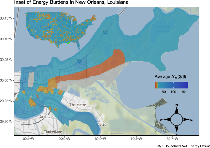
Urban inequity results in lower Nh populations not showing up in many dense or gentrified urban areas such as the San Francisco Bay Area, New York City, and New Orleans, as shown in Fig. 3. The pervasiveness of urban energy poverty in Detroit has been studied extensively and shown to have distinct geographic boundaries down to the street level19. While some of these conclusions are supported by existing evidence and literature, they should be confirmed with a rigorous analysis of this dataset using the Nh metric for the reasons explained in Applying NER to Energy Equity: extremely low-income households are not visible on a 0–100% scale, and households with no income are often discarded as outliers. Additional analyses should incorporate additional demographic and household dimensions due to potential disparities within census tracts since diverse neighborhoods may not be represented accurately by aggregate census-tract metrics.
From this high level, we can see in Fig. 4a that approximately 16% of households in the US experience energy poverty. Displaying these communities defined by their relationship to the US Federal Poverty Line (FPL), which indicates income poverty status according to government policy, in Fig. 4b provides a stark picture. While 94% of households below the FPL also face energy poverty, more than 5.2 million of those households above the FPL face this scarcity, underscoring the relative burden of energy expenditures as a poverty trap and the inadequacy of FPL as an indicator of energy poverty in particular. When we break the group of relatively prosperous households into subsets as outlined in Table 1, we find that 32% of households living at 30–80% of their AMI are experiencing energy poverty. This suggests that energy poverty may be a useful metric for identifying households at risk of other forms of poverty. However, we find that most households experiencing energy poverty are also suffering from a broader lack of access to resources characterized by income-based poverty. Given that the quality of energy used by low-income households is expected to be of similar inherent usefulness, this stark contrast in Nh on the households’ energy investments is surprising.
Figure 4c shows that households with solar as a primary heating fuel have a higher Nh (Nh = 111) than those which rely on other fuel sources (Nh = 33), even for households far below the income poverty line: the average Nh for energy-impoverished households utilizing solar power is 19, compared to 7 for those relying on any other fuel source. The slope of the Nh density lines in Fig. 4c indicates that these lower-income households seem to experience a different rate of return on Nh from the benefits of increased energy adoption than higher-income households. Why are certain households not receiving the same benefits of their fuel source across the distribution of incomes? This could be due to lower-income households’ low consumption, meaning that the potential savings from implementing energy efficiency measures are lower than for high-income households according to the prebound effect identified by Sunikka-Blank and Galvin29 and Cong et al.30. Despite technological progress and rapid declines in technology costs and availability for cleaner, renewable electricity generation options such as solar photovoltaics and energy storage, many households cannot take advantage. Most households do not have access to advancements such as low-cost rooftop solar or energy efficiency upgrades that improve air quality, lower greenhouse gas emissions, and save money31: only 18% of households that have adopted rooftop solar have been below the median household income in the US32.
Examining these dynamics by the status of homeownership in Fig. 4d reveals further disparities. Though renters and homeowners are similarly distributed below the energy poverty line (28% of renters and 17% of homeowners are in energy poverty), there appears to be an advantage of homeownership from a net energy perspective for lower-income households (Nh = 37 for homeowners versus Nh = 39 for renters). Only at a relatively high Nh do renters seem to have an advantage: owners of multi-family apartments earn 2.4 times as much as renters of single-family homes when normalized by energy expenditures. Renters face systemic disadvantages in the energy transition; they typically pay the home’s energy costs while the landlord controls infrastructure upgrades, commonly understood as the split incentive problem33. Tenure matters for more than just equity itself: renters are less likely to take actions to improve their Nhs due to a lack of property rights and split incentives. Even when action is taken to improve the energy efficiency of a rental building, tenants are less likely to see any economic benefits from it.
Furthermore, Fig. 4e shows that Nh varies widely by racial demography. Asian households have the highest Nh across the entire population distribution (Nh = 65), and Indian households have the lowest (Nh = 18), with Black households a close second from the lowest (Nh = 26). These relative positions are the same across the entire population distribution, with only White (Nh = 38) and Hispanic (Nh = 36) populations showing different relative Nhs across the population. Households in communities of color experience energy poverty at a rate 60% greater than those in white communities. Education level also seems to be correlated with disparate Nh outcomes according to Fig. 4f, with a wide gap between those households in areas with mostly high-school (Nh = 25) or college-educated (Nh = 40) populations.
Assessing the Nhs among different states in Fig. 5 presents a counterintuitive picture of how states address energy poverty and energy equity. Nh can equate communities that experience high energy costs and low incomes with those with high incomes and even higher energy costs. This explains why states such as Connecticut (Nh = 26) and Vermont (Nh = 23), where 47% and 30% higher than average electricity prices may pose affordability threats for communities affected by higher prices, are similarly positioned on the list to states such as Mississippi (Nh = 22) and Alabama (Nh = 24), which have significant low-income populations and low per-unit energy prices (22% and 8% lower than average, respectively). Not only are households in these states falling behind in terms of income, but net incomes are lower relative to energy expenditures than neighboring states and other parts of the country. This may be appropriate: while the equity issues in Southeastern states are well studied, states such as Maine that continue to utilize residential heating energy sources like oil and fuelwood may suffer not only from lack of efficiency but also health impacts. States may need to pay attention to these dynamics from an affordability perspective, and further targeted energy assistance may be needed based on a diverse selection of metrics.
Although they are the states with the highest Nh, California (Nh = 59) and Colorado (Nh = 63) are not immune to these problems and likely represent a greater spread and diversity of energy affordability impacts. Likely, this diversity captures the benefits accrued by early adopters and the challenges of having high populations of those struggling with energy poverty and high housing costs. In many of these places, residents have self-sorted into geographic areas based on the overall costs of living. Also, advances in clean energy legislation are a common thread among the top-performing states on an Nh basis, signaling the value of strong decarbonization targets and accompanying policies to ensure electricity affordability for low-income households.
Visualizing the proportion of end-use energy sourced from the combustion of fossil fuels in Fig. 5 shows that such reliance does not necessarily lead to a more affordable system for energy consumers. Households in states with a high proportion of fossil fuel are no less likely to have high Nhs than those in other states that rely on clean energy, defying the conventional wisdom that fossil-fuel consumption is a chosen tradeoff between environmental health and affordability for citizens.
Discussion
A sensible prior hypothesis is that everyone experiences the same efficiency from the energy system as measured by return on energy investment. Differences in absolute outcomes may be related to the quantity of energy investment, but the marginal unit of energy consumed by one household should lead to as much benefit for that household as any other. However, here we see that Nhs are different among different groups of households in the US. This difference is often correlated to factors out of the households’ control and even those related to persistent social inequalities, such as race and education. These striking disparities suggest the existence of deeply structural barriers to prosperity in the US. Energy is central to equity and economic prosperity, but the energy system appears to be regressive in that costs accrue disproportionately to those of lower-income levels.
Furthermore, we demonstrate that owning a home and consuming solar power are associated with increased income multipliers for energy expenditures. This advantage leads to gains that are not being realized by many communities. When households adopt solar power, their Nh increases as a result of decreasing their energy expenditures, which creates a disparity between those with access to renewable energy and those reliant on fossil-fuel-based energy sources. This helps explain why there has been a disparity in how the benefits of the energy transition are accruing among socioeconomic groups34. There is the potential for electrification and the transition to clean fuels to exacerbate this division if appropriate policies are not implemented35.
Indeed, there are clear, mutually synergistic, positive reinforcement mechanisms to alleviate health and environmental disparities in air pollution exposure by reducing household energy burdens and improving economic mobility across low-income households. Combustion of biofuels and hydrocarbons is a significant source of air pollution and exacerbates other household costs like healthcare and maintenance, yet we find that utilization of these sources is not associated with increased Nhs at a state or household scale. Not only are households living in more poverty and closer proximity to highly polluted areas at greater risk of adverse health impacts; they must also consume more energy to overcome the particulate emissions, which, themselves, reduce the efficiency of clean sources such as solar panels36.
The inherent benefits of solar electricity must be accessible to all populations in the US to promote sustainability, but communities of color are not receiving a similar benefit to white and wealthier households from their energy expenditures. Net energy metrics exhibit this income multiplier effect and the resulting divide. Designing solar policies to benefit those facing low Nhs may substantially improve net energy income ratios and raise households out of energy poverty in the US.
Pachauri et al. distinguish between affordability and cost of supply, implying that more focus should be applied toward how energy burdens vary among customers of different energy suppliers than on how per-unit costs of energy vary9. For instance, Roanoke Electric Membership Corporation is the electric utility with more than 10,000 customers whose members have the lowest average Nh (13), according to LEAD. At the same time, the per-unit cost of electricity in this service territory is only more expensive than 76% of utilities at $0.14/kWh. Is an exceptionally high burden acceptable because the per-unit costs are not exceptional?
This relevance especially holds for electricity because it is a commodity delivered via a stationary, centralized grid system, and households retain little control over their own energy choices. In vertically integrated energy markets, the monopoly utility is the only option available to all consumers. In organized energy markets, the public utility is designated as the last resort provider for those unable or unwilling to participate in the competitive procurement of energy. Even in organized markets, local utilities retain monopolistic control of the transmission and distribution systems.
Consumers are price takers with relatively inelastic demand. Changes in the unit price of energy or slight differences in consumption patterns matter more to those with low incomes than those with higher incomes. Furthermore, the current lack of storage infrastructure on the grid and behind each meter means that households are bound to electricity providers at the time of use. The “forward-looking” or “reactive” tendencies of these public electric utilities have implications for the energy transition in their jurisdictions and beyond37. A more in-depth examination of the energy system’s underlying regulatory structures and robust assessments of energy burden could provide a path forward and track how the benefits of the energy transition are being accrued.
In some markets, specialized rates or programs are available for Low and Moderate Income (LMI) consumers, who may have higher energy burdens. We find it notable that more than half of all funding to address high energy burdens in the US is from utility ratepayer-funded bill and energy efficiency assistance14. At a national scale, the Low Income Home Energy Assistance Program (LIHEAP) and the Weatherization Assistance Program (WAP) in the US seek to address aspects of energy poverty through bill payment assistance and energy efficiency measures, but the efficacy of these programs has been mixed in addressing distributional equity in energy burdens and receiving benefits from energy efficiency programs11. In part, this may be because these programs rely on income-based poverty lines such as the FPL to determine eligibility for benefits.
The US benchmarks its FPL to the food requirements of the average household38 and uses this threshold as is an eligibility criterion for more than 40 federal programs across ten agencies (in addition to state, charitable, and private enterprises that also do so)39. Practitioners have posited that the standard policy of “using the ‘economy food plan’ to determine who can afford to hire an attorney” may be depriving citizens of their basic rights40. In some cases, food assistance programs are more inclusive than energy assistance programs: we show that more than 5.2 million households above the FPL experience energy poverty.
Research using detailed qualitative sociological and public health interview data links energy burden with housing and energy policy41. Other articles have linked technology adoption barriers to low-income communities of color42,43,44 and identified that households that are in the same peer social network often adopt technologies such as solar45. While some studies already acknowledge the benefits of improving energy efficiency and equity outcomes through surveys and interviews46, this study adds to the literature by building a comprehensive quantitative framework and empirical result based on a large dataset. This toolkit adds more quantitative backing to this body of qualitative work and can be used in future analysis with technology adoption data to identify strategic opportunities to improve energy efficiency and access to clean technology in a more equitable manner.
Previous work provided theoretical frameworks for understanding energy poverty beyond a simple income-based measure7, and limited examples of applications to empirical data that rely on building-specific efficiency characteristics12 or subjective self-assessments13. Applying Nh to a nationwide dataset for the US builds on this work by providing a tangible tool that includes 5.3 million households with energy expenditures greater than their incomes or with incomes above the FPL that are left out by other measures, and is a way to visualize the disparities between groups that may allow for further investigation around different household characteristics. Nh highlights inequality better than a simple linear metric while allowing the assessment of a wide variety of households, such as those with no income or for which efficiency data is not available. A significant insight from NEA that should be incorporated into future work is that embodied energy takes many forms across the household budget (food, goods, services, transportation, housing, etc.), and these can all be compared using the same units of measure (e.g., joules) to scale the Nh framework across multiple expenditure categories.
The Coronavirus Disease 2019 (COVID-19) pandemic and associated recovery measures may be a critical opportunity to provide relief payments related to energy expenditures and to invest in more efficient residential47 and commercial energy infrastructure that enables newer and cleaner systems48. We show that US households are already spending excessive amounts on energy, notwithstanding more families staying at home for longer periods of time during pandemic lockdowns. The ongoing crisis offers a chance to address inequity with a focus on residential energy burdens49. The EU is in the process of defining how communities can participate in the energy transition50 and how burdens can be alleviated through this process using proactive policy tools and business models such as One Stop Shops (OSS) for energy efficiency and renewable energy upgrades51. Adopting energy criteria for energy and other programs like these could expand access for those underserved populations in need of assistance independent of their needs in other consumption categories.
Creating a federal energy poverty line would be a critical step in identifying families that face large disparities in access to affordable electricity and energy in the US and improve programs’ abilities to address energy burdens. A toolkit based on this analysis enables neighborhood level outreach where burdens are highest and identifies opportunities where households could benefit from emerging technologies.
Original Source: https://www.nature.com/articles/s41467-021-27673-y

